Building Design System
ASBL
Finance
View more
48
30
30
20
48
Role - lead Designer
Build a sustainable design system for a web application; ASBL Finance.
Goal
Consistency
Ensures a unified visual language, making products look and behave similarly across various channels and teams
Scalability
Designed to handle increasing numbers of screens, products, or teams without sacrificing quality; clear guidelines and component libraries streamline growth and adaptation.
Efficiency
Minimizes repetitive design tasks and enables rapid product updates
Finance is the discipline that manages money, investments, and financial planning to ensure the smooth operation and profitability of an organization like ASBL.
ASBL
Finance
Branding
Branding



Ab
Inter
Regular
Medium
Semi-Bold
Bold
11
12
14
16
20
24
Color
Color
2463EA
EBAD33
BRAND
SUPPORTIVE
475569
00A991
DC4A41
EB7D33
8B5CF6
FEEDBACK
Icon Library
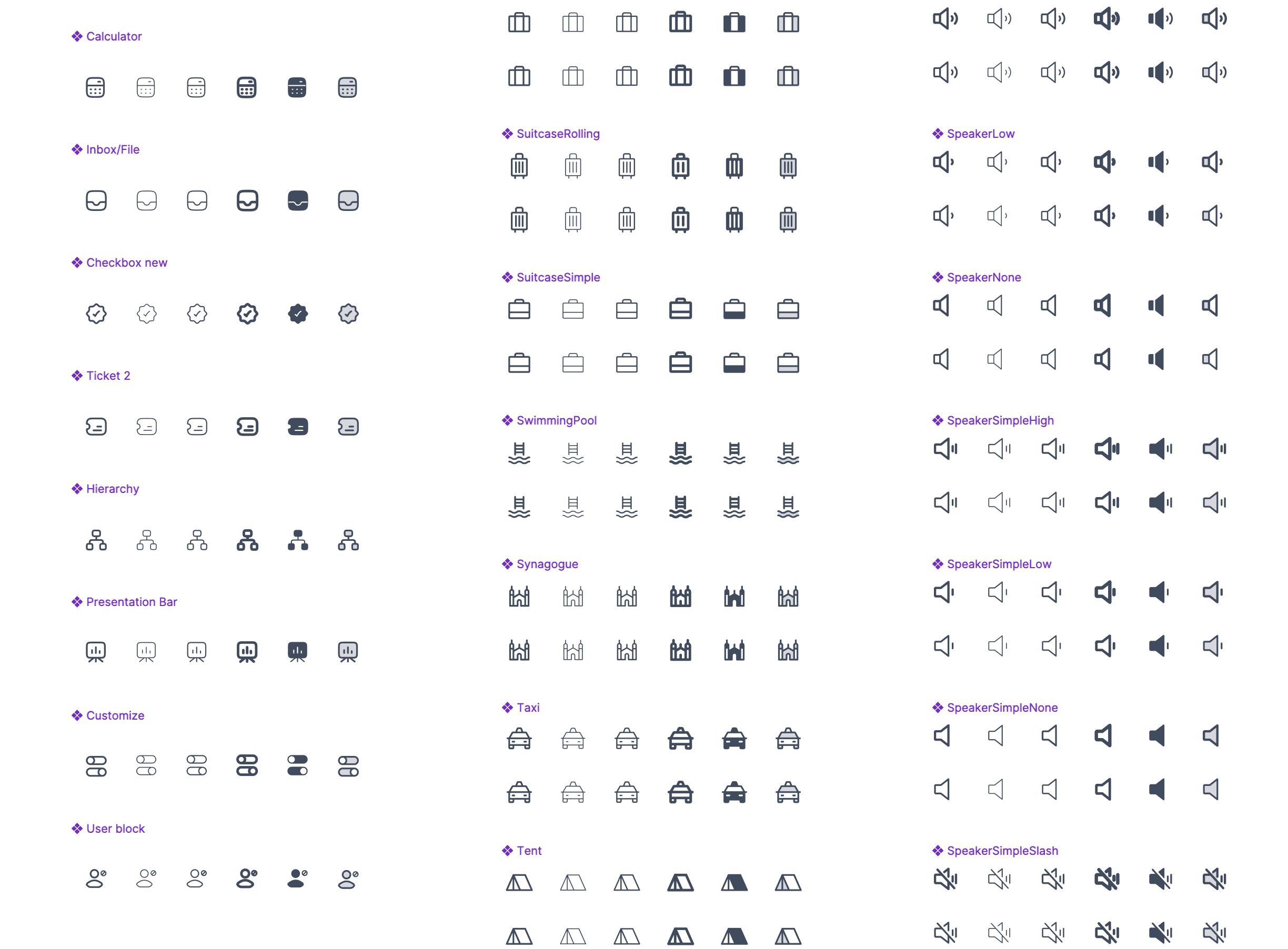
Designed custom icons as project required specific icons for unique features.
Colour Palette

Components


Micro components ( Badges, checkbox, micro interactions )
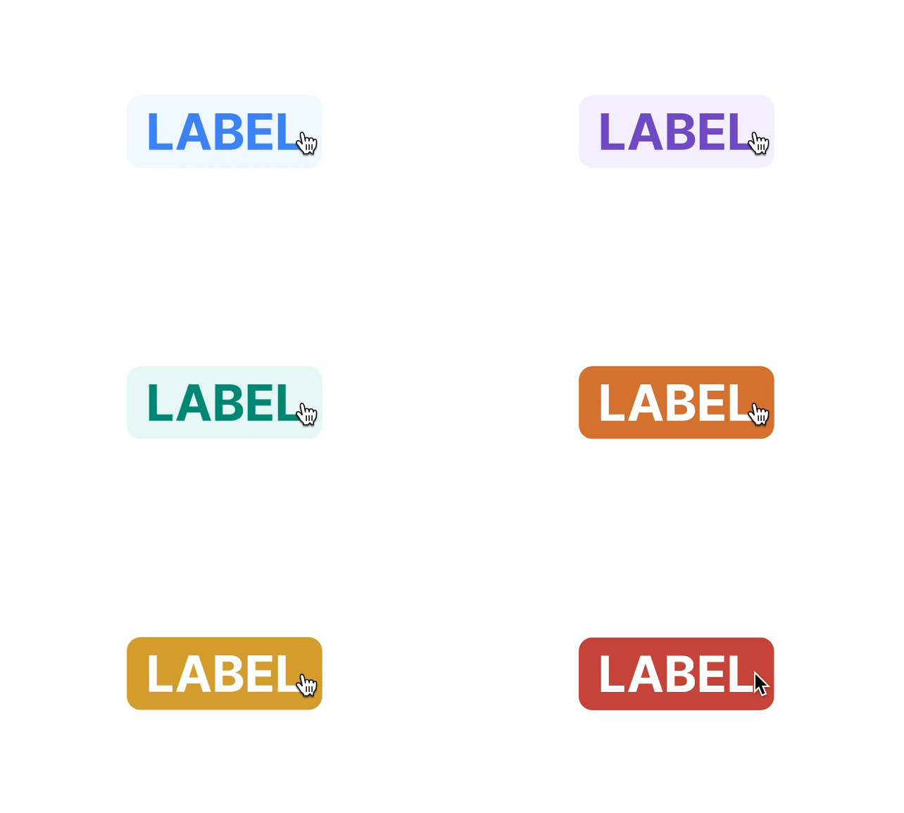




Navigation

Toasts


Branding
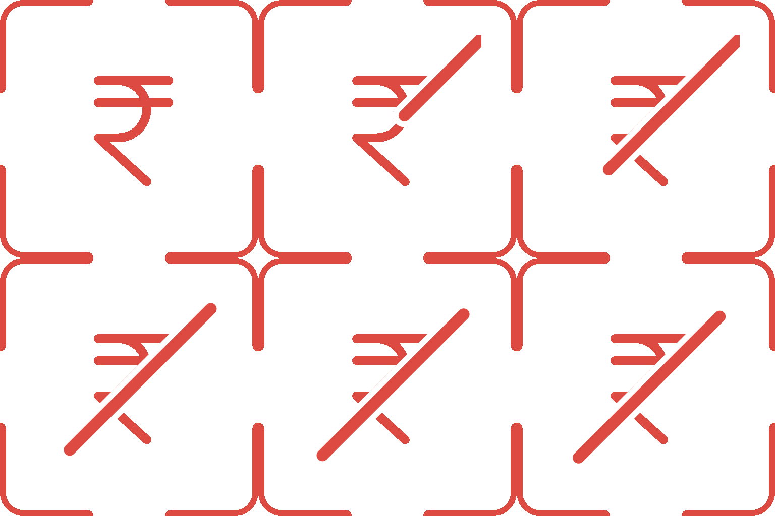
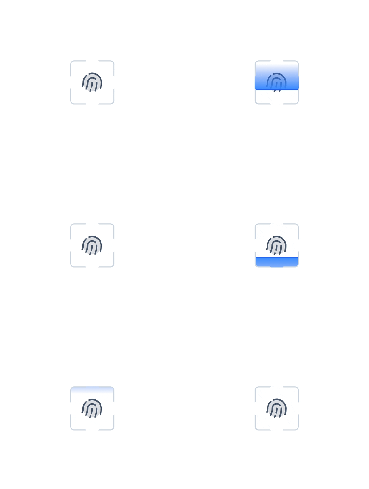
Micro-Animations




Branding
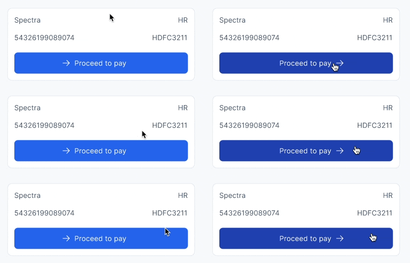
UX Animation
Guiding behavior, Clarifying user actions,
Instantly understandable status updates
Making digital experiences feel lively and intuitive



Thanks for your attention.
Let's talk
abhinav.design17@gmail.com
ABHiNAV
SiNGH
For the best experience
Please view this portfolio on a desktop.

ASBL Finance
Design System
Lead Designer
Building a Design System from Scratch
A 0→1 system that replaced phone calls, paper logs, and gate-level guesswork with real-time entry control across construction sites.
Why this system exists
ASBL Finance manages money at construction scale
Handling cashflow, inflow/outflow tracking, payment disbursement, and account statements across multiple projects and departments.
As a financial product, it demands precision in information hierarchy, status clarity, and trust signals.
A design system wasn't optional. It was the only way to build something that scale teams could rely on consistently.
Consistency
Unified visual language across all screens and teams, same components, same behaviour, same trust.
Scalability
Clear component guidelines that handle new screens, features, or teams without breaking quality.
Efficiency
Eliminates repetitive design tasks. Enables rapid product updates without starting from scratch.
01 · Foundation
Branding, typography, and colour - the base everything builds on
Typography
Inter
24
Heading
20
Title
16
Body text, regular
14
Body text, small
12
Caption text
11
LABEL · UPPERCASE
Weights: Regular · Medium · Semi-Bold · Bold
Colour palette
Brand + Supportive
#2463EA
#EBAD33
Feedback
#475569
#00A991
#DC4A41
#EB7D33
#8B5CF6

02 · Token architecture
Semantic variables
Background
BG 1
Neutral/Grey 00
BG 2
Neutral/Grey 100
Text
Default
Neutral/Grey 700
Light
Neutral/Grey 500
03 · Component library
Every component built with properties and states

Calendar / Date picker — with range selection

Navigation sidebar — Finance web app
04 · Icon library
Custom icons for unique financial features
Custom
Calculator, inbox/file, checkbox, ticket, hierarchy, presentation bar, user block, built for Finance-specific flows
Standard
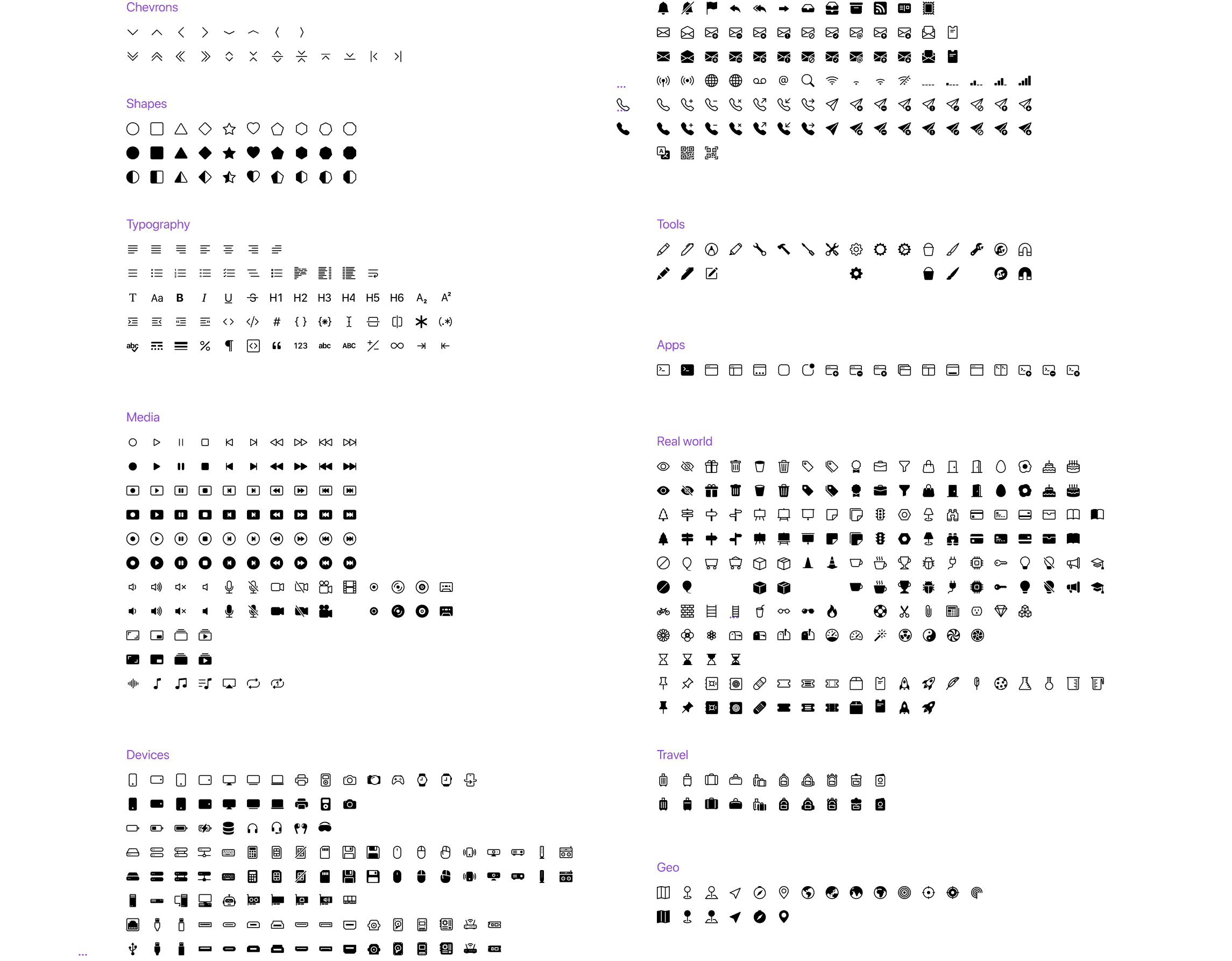
Chevrons, shapes, typography, media, apps, real-world objects adopted from a unified icon library
Principle
Same stroke weight and optical size across both sets, custom and standard are indistinguishable in use
05 · Feedback patterns
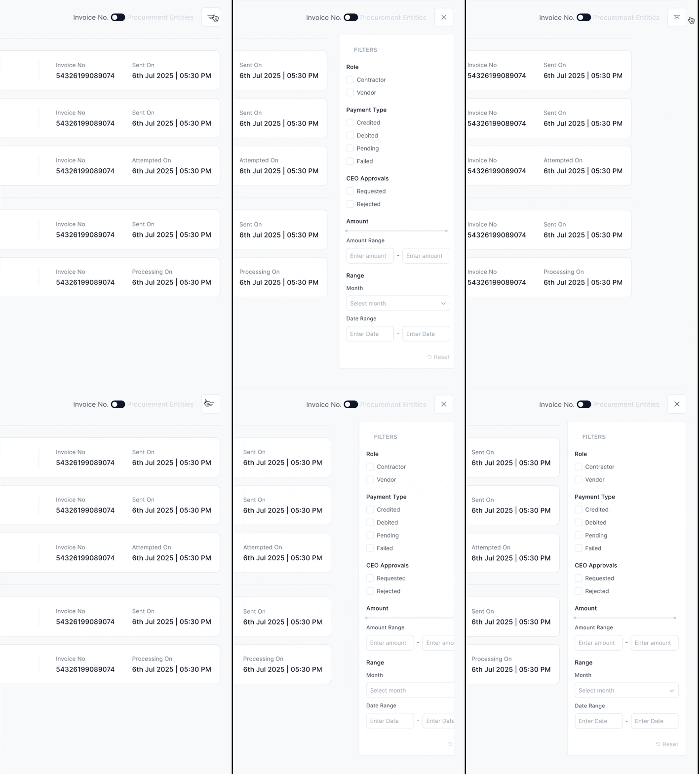
Toasts, micro components, and notification states
Toast states
Error · Success · Info · Warning - each with optional title, body, and dismiss action
Badges
Status labels for financial states: Debited, Pending, Failed, Operational
Form atoms
Checkbox, radio, toggle- all with complete state coverage including error and indeterminate
06 · Motion
Micro-animations - component states
Payment pending · Scan states · Loading indicators
UX Animation - onboarding and transitions
Guiding behavior · Clarifying actions · Status updates
07 · The system in use
Account Statement : the design system at scale
Impact
What the system delivers
30+
Components with full property and state coverage in Figma
Typography
Token-based — no raw hex values in any component; all reference semantic variables
Colour palette
Components with full property and state coverage in Figma
Let's talk
abhinav.design17@gmail.com
ABHiNAV
SiNGH